Client
Task
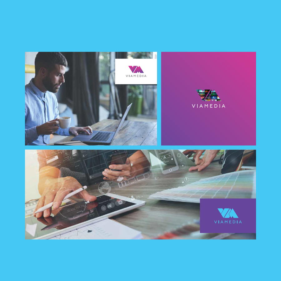
Rebranding of VIA MEDIA – a leading distributor of content (TV channels / TV programs) for operators – providers of telecom services.
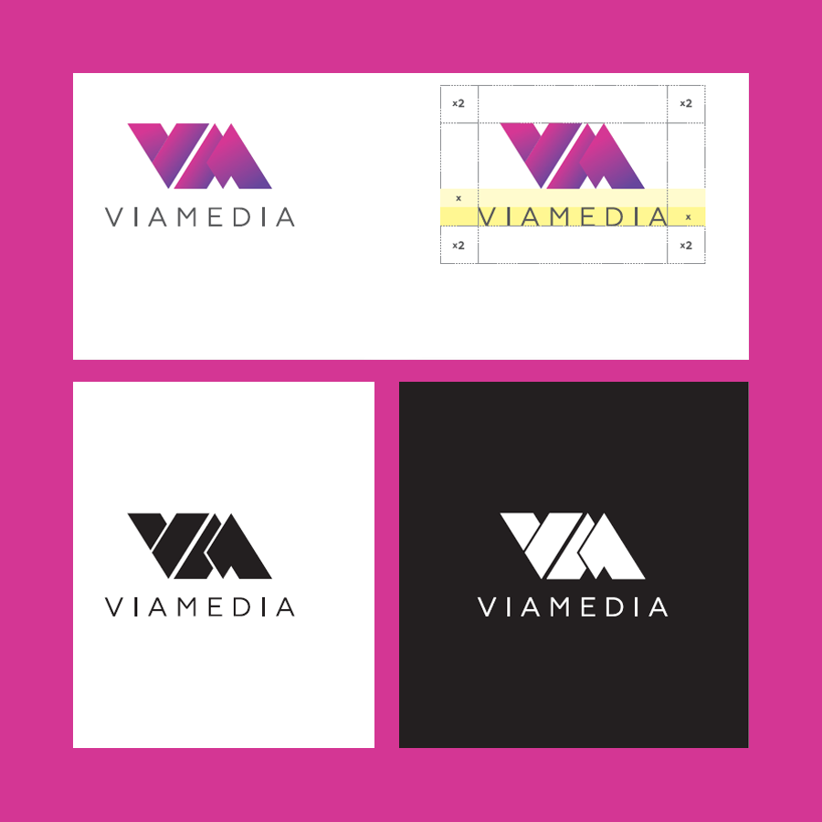
Working with many foreign partners (such as FOX, Turner Broadcasting System, SPI International), it is necessary that the logo contains the full name of the company in Latin. In addition, since the company’s logo will be placed along with many TV logos, it is important that the name is easy to read in both color and black and white.
Solution
The logo uses the first capital letters of the name VIA MEDIA, which are combined into one character.
The logo is made in a modern style of icons with gradient colors.
The “VM” symbol is assembled from different planes, which symbolizes the diversity of media content presented by the company.
The main version of the logo uses a gradient to emphasize the volume and shade the elements from each other.
The logo uses three main colors: purple, pink and gray. As an additional color, blue was chosen – it goes well with all of the above.
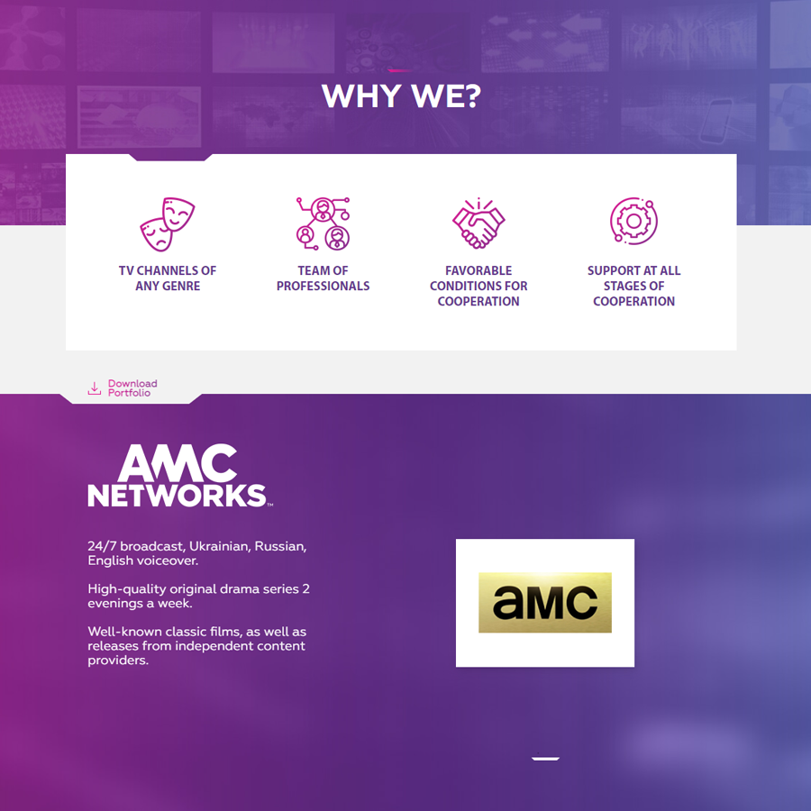
After developing the logo, the next step was to work on the company’s corporate identity, guidelines and the whole set of the necessary identity, which were fixed in the prepared brand book. A new design of the company’s website has also been developed on the basis of corporate style.
Thanks to the full rebranding, VIA MEDIA has clearly stated the growth of the agency, its ambitions and customer trust.